Search This Blog

Showing posts with label Creative diary; Creative task. Show all posts

Mar 1, 2011

Module 2; Assignment 3; Light and Shade - In and Out


I enjoyed looking for interesting objects, forms and shapes outside and when starting inside – it becomes fascinating. All of a sudden objects get a different meaning – more difficult inside than outside. Inside one is surrounded by all that constitute a home; your own home and many if not most of the objects have been there for ages and “just sit there”. Some of them have been placed for decorative reasons and others are in use every day. I do think that the objects that are in use every day is the perhaps most interesting concept – to be given another purpose. Outside I have been looking for contours, patterns, roadsigns and houses.

Exterior:
I was lucky to be able to take some of my exterior photos on a sunny morning – it does give you more opportunities. I have somewhat got hooked on form and figures and the business of looking for patterns and forms inside the masses of tree trunks and naked branches outside my kitchen window. However I have made that into a separate project – and will play around with the different shapes to colour them, to stripe them etc.

  ¨One picture of my beloved trees. I have manipulated my pictures – normally to create higher contrast which means this picture does not display a range of tones. It is however giving the impression of tones due to the collection in the right lower part of a burst of fine branches – almost like a bouqet of flowers. This contrasts strongly with the upper left and the dominating feature is the very strong impression of the trunks. I like this picture – and makes use of it and its collegues.


This picture is one of several in a row opposite the library in Saffron Walden. It is particularly interesting due to the combination of the very black, slightly ornamental iron work – and the white reflection of windows in the very upper edge of the picture. In addition it has a foglike and quite exciting body behind the bars with a hint of windows – but also of me photographing. In this picture there are different tones and of special interest is the ornamental whitish barrier of the balcony in the upper part in combination with the black ornament together with the really black frame. A further opportunity to see is of course the face – upper white windows are eyes, lower middle  cropped iron bars form the mouth and the iron “flower” could easily be a nose. There is another image that appears – that of somebody seen from behind having climbed in the fog to have a look through the inviting windows inside the balcony. Thoughts like somebody excluded who enviously views life inside this window – do pass through my mind.
Turned upside down the upper iron ornament does become a woman, from the back possibly dancing for someone watching from the inside! If such a translation is made, it would be cropped along the mid iron bar.


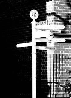
This image has been manipulated to increase its contrasts and to decrease the “middle tones”. I think it is very interesting with the signs in the middle poking in all directions but into the dark – where one has no idea what is waiting. There are contrasts between the iron fence and the checked, rather light brickwork. And – the shadows on the wall create a pattern, almost like graffiti on the wall. Perhaps the balance between the very black left half and the much more containing right half is poor – but for some reason the only left pointing sign rebalances it and altogether I feel there is an opportunity to further develop this image – by cropping it in different ways – perhaps the upper quarter, or keeping just the middle vertica strip – or why not the upper half, cropped just under the lowest white sign?
 Pargetting is rich in these areas and this detail comes from one of the oldest if not the oldest house in Saffron Walden. I have increased contrast and cropped it from other patterns – however I could change my mind. I love the pargetting custom – it does not exist in Sweden to make decorations in this way. There are different patterns and one of them ids a depiction of a saffron crocus which was the trade of Saffron Walden in medieval ages. I think I have made the image interesting. If one almost closes one’s eyes watching the curved and straight black lines running diagonally become more obvious as well as the vertical lines – hence a checked appearance. However with a closer and clear look the very pattern in each little area become intriguing and one can discover they are different – actually three different patterns beautiful arranged and shadows increase the graphical impression.
 The tower of our “wedding cake” library - I just had to include a detail of this building dominating our market square together with a mock Tudor town hall. I think the image is a good display of black and white contrats together with shadows and not the least the soft lighter part of the sky behind the sharp image of the tower. This picture could be developed by cropping different parts – or by blackening or whitening out some areas. I do feel the left part of the tower with its black “hole” for the clock combined with the more ornamental lower part – could be interesting. If one includes the very upper tower and blackens or whitens the front clock it could add an exciting feature.
 
This picture I think is beautiful. When I saw the shadow on this door – it was an immediate wow! I have worked it into a blacker shadow as I wanted a more dramatic picture. The black shadow combined with the striped part gives a striking impression. The small “dots”
Create an interesting decoration – but help to emphasize the rectangular forms. The door knob just brakes it all up in a  good way and depending on image quality the tear and ware signs on the wood work of the door also helps to create an interesting balance in the picture. The shadow vertical stripes help to balance the very black parts and this picture is striking!
Interior: 
This picture is taken from above a large glass vase, on the side of a white table standing upon the limestone base in front of the fireplace. When looking from above, I was struck by the circular shades created by the vase – a bit on both sides. The picture created “inside” the vase is interesting as there is a certain ”wave” pattern formed and I also think the forms – very strictly round and circular, together with the curved table edge, contrast very well with the straight lines of the wall and skirting board as well as the limestone base. There are definitely several tones of grey in the picture, and perhaps could the picture be a bit manipulated to create something on the side of the table – to “frame “ it a bit – however I am not quite certain.
One could crop it so that the round forms are dominant and filling the picture – could be interesting to try.
 
Two completely different objects – a Chinese vase and a modern potted bowl with a lid. I liked the contrasts of the pattern of the Chinese vase compared with the form of the top of the pther. There is also a tendency of shadow to both objects as well as the reflection on the surface they are standing on. It is very white in the ackground – but that means one feels they are free and I like it.
Several different tones of grey and black as well as bold black and bright white – both in the objects and the background.
It strikes me that photos of the top of the modern pot can be combined – perhaps with the patterns of birds I have found in my trees outside my window?
Our toaster from above became a quite interesting photo I think! There is a good balance in this picture between light and darkness, and a feeling of well proportioned framing. Then the details of what goes on in the middle makes one curious – they are small details in a larger picture with fairly bold lines. This photo has also an outer boundary – as it has a dark background – compoared to the previous photos. I like this picture.
 This is my pot with different kitchen tools standing beside the cooker – from above. It did create a quite interesting picture where one becomes curious and looks for things to see and to identify. I can immediately feel that it is a bouquet of flowers and itch to makenit still more so by stitching.It has a vivid pattern of different tones and a wild mix of patterns and forms. There are small patterns as in the whisk as well as intriguing curved and folded patterns as the head of the pair of scissors as well as of the white spoon. I am going to make a line drawing of these particular forms – to save for later use.  There is also an interesting fairly sharp line that goes from mid-right to almost the left edge which almost divides the picture in two – perhaps one could play with cutting it in two and position the two parts in a different way. 
Motif is evident – kitchen corner. I have manipulated the image and I think in an interesting way as it gives some more space for imagination. There are very white areas, there are grey with some reflections in it and also quite black areas. Forms of bottles are always harmonic as they frequently display both straight and nicely curved lines. It is also fun that some of the heads with the capsules seem to be hanging in the air. One could play with this picture – to insert bottle forms from above.
 
This is a very ordinary motif – however I think this stack of plates is extraordinary beautiful. The slightly curved shapes, the black and grey tones and the very soft edges of the white lines. There is also an interesting effect on the top of the pile and I think the bottom of the lowest plate adds an interesting feature to the picture.
Picture chosen for enlargement to A4
I have chosen the window with the iron bars described above – and I think I have described my feelings for this picture as so much can be read into it. I have enlarged it to A4 but I have not cropped it – it could be cropped on the right side to remove the stone frame that is visible – however I feel that edge adds to the picture, parly because it is a bit rounded to give the picture somewhat more softness, but it also has some vague pattern that also adds interest.
Task 7 
Transferring an image onto fabric
I have chosen to transfer the image of the old door, with the very black shadow. However, I first made a photocopy of that door, but in a fashion so that there were nine copies on the same sheet. That way it became still more intensive. As I do not really know how it will come out from this process, I wanted to have something that would stand out! I had a white tight-woven fine cotton and I think that will be a good support for the image.
However, my plan for how to use this image really was to decorate the stripes of the doors with silver lurex thread along the ridges of the doors, but on some doors add a strip of Al-foil to make it a bit more varied.
Then I plan to open a few of the doors, somehow crudely line the doors and if necessary stiffen them a bit and behin these doors – or actually windows as they become with the lay-out of the nine components on the same picture.
Behind the opened doors I will place pictures of the small couple from the Valentino picture but in some cases mounted on the “dancing” lines from my “stretch-fabric” drawing. I will play around with those lines – once I have the printed picture and see how I best and creatively can combine these pictures.
I know I am going to print in a further task and then I thought I can take the opportunity to print a fabric, onto which I can mount this present print – with some decorations on the doors.
This little figurine can be inserted into the pictures below and make it all more interesting behind those windows. I can also use the line figure I used inside the stitched eye, a line figure found in the first line drawing we made. I will also make a partial line drawing of the photo of my kitchen tools from above where there are also many interesting lines.


Feb 28, 2011

Module 2; Assignment 2b; Own Series of Drawings


I have made a series of drawings using different techniques and I have tried to vary the style. Perhaps I have not quite succeeded in making a varied balance between tones and contrasts – and welcome views.


A Shoe – “My Party Shoe”
I started off with a shoe and picked deliberately out a “party-shoe” with an ovious bow and open toe and open heel. I decided to make this on an A3-format and to use black ink and a bit “flimsy” technique. I tried to draw with my whole arm and drew quite lightly. I was a bit inspired by the images of the ducks in the “task paper”.


I fee I managed to capture the character of the motif and was quite content with the way I varied different depictions from different perspectives. I also think the balance of the picture is OK with a few thicker lines and a few “flimsy”.

A Body part – “The Skull to be Dressed”
I decided to be a bit more elaborate than just drawing a part of my or somebody else’s body part and got the idea of “dressing a skull” – when looking closely springs can be visible between the mask and hair and the skull. I was also inspired by the diamond encrusted skulls by Damien Hirst but there are several artists doing skulls with a similar concept.


Dress the skull
 When inspecting the result – I think I should have made the contrasts much more visible. It is somewhat difficult to separate the skull and the face mask.

Something that grows – “Onions in the Net”

When selecting onions as “something that grows” I thought of different concepts – onions that really do grow – in the soil and under the ground – with long straight leaves above the ground – but also the fact that once they have left the ground they are dried and placed in a net – as in this case. Hence I made the lower right corner black. I glued black paper on to the drawing paper before starting to draw. Gradually when considering the composition I thought of Vasarely’s work and found out that onions are fairly typical and graphical in form and structure with “leaves” that constitute the body of the onion. I also wanted to depict the netting in one or another form – and ended up with the harlequin pattern filled out with different tones in order to create a balance in the picture but also areas of different tones and contrast.

Onions in a net

Onions in a net


I feel I succeeded to make a fairly exciting image of onions in net, and added some onion “flowers” on the leaves above ground as well as some roots below ground.


View from a window – “Tree house with tree on side”

I have for the four years living in our cottage style house looked upon the trees outside our kitchen glass doors. In particular in winter these trees –form a very interesting graphic picture with their trunks and branches. Funnily enough I have thought for a long time – “what can I make of this?” – then I got the task – and it was obvious what view I was going to explore and draw. I also for the first time decided to paint on fabric – medium-dark-grey acetate (or viscose?) lining fabric found in the depth of my basement boxes.

When I had made a line drawing of the main trunks and branches – I realized I had two choices. If turning the picture to landscape format there was a very obvious ship to develop. It did not even have to be developed – it was there.

However – in portrait format – it was a still more obvious house – an office building – a high-rise building with loads of people working there and a tree outside, oartly interfering with the building.

I painted with gouache colours on the fabric and that worked very well. The finishing touches – making windows on the building and a few office workers going up and down the stairs, as well as cars in the parking lot to the lower right of the picture – was made by ink pen and white masking fluid.
I was very content with this picture – I think there are interesting contrasts and forms as well as a harmonic mix of forms and tones. The stems and leaves on the tree on the side and in front of the building is the only motif that is still there – from the original photograph.


Tree - now an Office Building

Parking outside the building
 

Mechanical thing – “Farmer pushing cart into the big city”


I photographed the old antique kitchen scale (heritage from my grandmother – and still in use) from different angles. However when looking at it from behind – there was this obvious man or woman seen from the back pushing his cart with a load – of something. I happened to have photographed a stack of large plastic sacks of hay, outside a shop in town – and printed it and used it to load the cart. I had also found a fascinating picture of London by the photographic artist who is taking thousands of photos from above of ten big cities. I felt an interest to mix this vintage farmer on his way to the big city aspect with his cart – hence also adding some cars on their way in and out of the city. I also used newsprint (with deliberate mounting the “direction” of the print so as to achieve some perspective feeling) - as a backing for the coal drawing. Could perhaps have increased the white surfaces – perhaps not my best drawing in this assignment!


Feb 7, 2011

Module 1. Assignment 3:2 "Tony Cragg"

TONY CRAGG

Tony Cragg is a British sculptor living in Wuppertal in Germany since 1977 when he was fresh out from Royal College of Art. He was born in Liverpool in 1949 and initially worked for a couple of years as a laboratory technician in a laboratory of rubber science. He left and was admitted into Gloucester College of Art and Design followed by Cheltenham College before he entered Royal College of Art in London in 1973.

Tony Cragg is a major artist among sculptors and has been very active in the contemporary world and debate. He is now the director of Kunstakademi Düsseldorf and was elected Royal Academician in 1994. He has been awarded a range of prizes through the years such as Turner and several more.

Cragg has worked with more raw materials for his art than almost anay other known sculptor, and I think that has been part of my liking of his work. He has said that the word material originates from the Latin word “mater”, mother, and means that the emotional perceiving of the material, both for the artist and the viewer, the material itself gives rise to the thought, its properties gives rise to the idea which produces the form.
When I read this quote, I did to some extent recognize my feelings when seeing and touching a particular fabric. I enjoy just fabric browsing and it is normally my reaction to a fabric that decides what it becomes. Now – this is somewhat pretentious (Some understatement!!) but I did think it was an interesting observation.

Stacking, splitting and crushing
He started his sculpturing by using mainly found objects and used them and challenged them in many different ways. He sees physical matter as the fundamental basis of experience. One of the first work he produced was a stool and little wooden pieces. In his early career he worked with stacking, crushing and splitting in a methodological and arranged way such as in “Stack”, 1975, mixed materials. This sculpture is very geometrical and could be interpreted by how manmade and natural materials are intertwined to form our environment. My own initial thoughts were that this particular piece of work was not very beautiful, and I rather felt it depicted a filled rather ugly shed. However, starting to look into what is stacked in that shed it becomes a bit more amusing when identifying the different objects and looking at it quite some different forms become apparent, there are coarse bricks in grey amnd with holes in them, there are wooden planks and there is folded or rolled material and it all forms a composition with a certain design in colours and form composition. I still do not think it is very beautiful.

Fragments of plastic and other material
He rapidly continued to collect fragments of plastic which he arranged by colour and made many interesting pieces of work by arranging patterns and reliefs on surface.
“New Tones Newton’s Tones”, 1978, consists of a rectangular arrangement on the floor of plastic fragments assembled in colour groups according to their position in Newton’s colour spectrum. It has been suggested that fragments of material waste is really to an urban society what fallen leaves are to nature. In my view that is quite a rational as well as mentally proper symbolism. I quite liked that idea not the least with that thoughts in mind – seeing the surfaces in forests and under trees and bushes as nature’s own scrap yard. and I also thought it was a rather interesting symbolism considering how beautiful nature can be in the autumn with all the leaves in different colours on the ground.

Another example of this period is a large mural , “Britain seen from the north”, fragments of plastic, 1981 and part of Tate collection. He made this at a visit to Britain and depicts himself studying England positioned in “horizontal” position from “the north”. He is looking at this region which suffered hard from the then economic climate but as he was living abroad he was an outsider. Further examples are “The streets are full with cowboys and indians”, fragments of plastic 1980, colours mainly in yellow and neutral. “Union Jack” 1981 depicts the flag made from arranging fragments of mixed materials and in the characteristic colours onto a surface. I still do like his “plastic” collages – in my view they are imaginative and I am attracted to the thought of making beautiful or decorative things from scrap material.


Further materials, stone and wood
“Three modern buildings, 1984” is made from the stacking of different types of bricks, in colours terra cotta, yellow and grey – a sculpture I like very much. There is a simplicity in this piece that attracts me. The holes in the bricks form windows, and the composition is brilliant.. This piece attracts me as in my eyes it is decorative and an eye opener as how a few of the coarse, kind of primitive bricks supposed to be used in thousands for the walls of a house can be tricked into becoming the sole components and still become “a complete” impression of a house.
“La citta”, 1985, wood, is a collection of regular pieces of seemingly sawed pieces, like little blocks that are assembled in a slightly circular, spiral form, held very tight together really reminding me of an Italian village or small town climbing around a hill top. The way the sculpture is displayed in the picture I saw, with window light coming from the top, the town looked as if it was bathing in sunshine strengthening the feeling of southern Europe. Beautiful and interesting! It even transmits a certain ambiance…I can imagine the little shops, bars and the central piazza…and the beautiful women and handsome men, as well as the little old women and med in black – walking through the little streets. It is amazing how this “collection of wooden blocks” can in this simple form create a very obvious village just by the way of it has been assembled.


A few years on, steel, plaster, glass
“Minster”, metal, plastic, wood and rubber, 1987-1990, is a huge sculpture/installation in five to six pieces, the highest is five and a half meter. It is typically stacked and made from machine parts in several materials and gives some impression to be minarets or a collection of churches from the Greek-orthodox culture or towers. Initially before I managed to look properly and saw that it was made up from stacks of many components - I did get some little internal flash about grenades from old times or very modern missiles --- made into church towers. Some of the round and conical parts are painted in red, green and blue. Tony Cragg has been quoted to say: “manmade objects are fossilized keys to a past time which is our present.” During this decade he also made large steel constructions and huge versions of laboratory instruments.

Next decade – the nineties
He did continue to make semi-scientific vessels such as the “Bromide Figure, 1992, a glass sculpture which also reminds me of churches and minarets but he gradually also started to make more “organic” forms and suggests that he examined the relation between the natural and artificial world. “Trilobites” 1988 depicts the prehistoric fossil, in its origin 4cm long and three-lobed, “infested” or imprinted by a laboratory vessel. Many interpretations are open – one being the examination of the relation between the artificial world and the natural – another could be the impact on nature of artificial, or scientific activities, or other interventions forced upon it by man. I do not like this sculpture that much as I have some difficulties for all possible worms or larvae and I cannot help the association. I feel the type of form or forms of these trilobites are coming back in several of Cragg’s works, the almost draped rounded forms or round sections in more or less soft forms – and I like these forms very much.

“Spyrogyra” 1992, glass and steel, I could see as an ingenous bottlerack– my very first impression was not quite as wild – or wilder - to me it was an immediate Christmas tree … The bottles have been sandblasted, hence been made more elegant than the originals. I think this is a really fun sculpture which I could even see as a big lamp had some of the bottles been illuminated.

“Ferryman” 1997, bronze, has a more organic form and has been produced from bronze perforated by round holes which gives the piece a light impression in spite of a rather compact and complicated form. It also makes it interesting as in some angles you can see trough the holes to some extent and light comes through.

“Forminifera” 1997 is made from plaster and steel and consists of a few huge laboratory vessels, with the plaster surface perforated by holes, a similar method t he has worked with in bronze as in the previous “Ferryman”.To me the impression goes to Roman amphoras even if the forms depicted in the vessels are not that of an amphora. I feel perhaps the whitish soft colour and the several forms anyway makes an impression of an archeological exhibition. Laboratory vessels are frequent forms in Tony Cragg’s work.

Last decade
This last decade he has continued to develop the organic forms but quite a few of his recent works display the curved structures, kind of sharp edged curves stacked or twisted upon each other to form different characters. The faces seen in his different varieties of faces or heads “Bent Minds” and “Two Minds, 2002, can be traced in some other work. “I’m alive”, 2004, stainless steel could be almost a slender fish wriggling of life, or somebody standing in an athletic position or yoga position with a bent back – showing off his physical and mental capacity. I feel his “double-minds” are genial the way he depicts the dual concept – both elegant forms and thoughtful, with faces in two directions, one kind of twisted from the other. “Levelhead” 2006 is another of the same structural and conceptual feeling as is “Wild Relatives”, 2005, wood, which has some similar features.
During very recent years he has painted some of his bronze sculptures such as “Red Square” 2007 and “Outspan” 2006, yellow painted bronze. This gives a lightness to the sculpture which is quite interesting. He has previously worked with perforated bronze which also has given lightness and now colour adds both a very different impression as well as lightness.


Cragg in Paris, “Le Louvre”
Cragg exhibits right now at “Le Louvre” in Paris. He shows seven sculptures in the space under the glass pyramid. This is the first time ever an exhibition takes place underneath the pyramid. The first sculpture to be seen when entering the space is created for this occasion and exhibition. It is called the “Versus” and is red with a complicated layering of his round forms, almost like discs of various thickness and size, sharpness or bulk stacked upon each other in a complicated pattern, around an axis. In this sculpture one could stand looking for all kinds of forms or perceived form symbols. I lik this very much as it appeals to imagination and to round, round to follow his rounded structural forms. Further sculptures paired with antique sculptures in the museum are black, or perforated bronzes and become enormous contrasts to the Louvre classic sculptures!


Summary:
I chose to explore Tony Cragg among the suggested artists as his recent sculptures were the first I came across when researching their works. I saw his double faces and some of his painted work and fell immediately in love with his feeling for form. I seem to be attracted to rather explicit form, bold and obvious forms. I have during my exploration of the cubists become very fond of the cubistic sculptors as well. More etheric impressions that I got from the first I came across made from Cornelia Parker appealed immediately to me as well, however for some unexplainable reason I chose Cragg. When I continued to study Tony Cragg I became extremely fond and impressed of his variety both in the form used and materials used. I was also struck by his view that the material in hand, commands the form developing – a somewhat concentrated interpretation on my side. It is interesting also to read an interview where he claimed that he does not make any thematic series – because when one piece of work was finished, that provided the base for a continued and further development instead of making another interpretation of that same concept. When looking at his several works with his “twisted” disks and round forms almost around an axis I feel that some themes can be traced – on the other hand he has been so enormously prolific and I have only seen a small fraction of what he has produced. He has also produced a large number of sketches and drawings, not only sketches of a planned sculpture. Many of them are also very interesting, but I chose deliberately to make my own impression and little “scratch on Cragg’s surface” only on his sculptural production!

Module 1. Assignment 3 - 1; Putting it into context; Cubism

Cubism has its roots in the beginning of last century and Cezanne can be viewed as the early father of cubism even if it is Pablo Picasso, George Braque and slightly later Juan Gris who are really seen as the artists who initially developed the cubistic artform. The name cubism was first used by Louis Vauxcelles who was an art critic who first saw a picture made by Braque and who said it was a picture of many littles cubes. The new art form spread through Europe and to the US where it was considered shocking when the artworks of several cubists of the times were exhibited at several different occasions, but the “Armory Show”, 1913 in New York was groundbreaking for cubism to spread outside Europe.
Further major artists who were active in this time were Fernand Leger, Robert Delauney as well as his wife Sonja Delauney. Another was Francis Picabia. (who once copied the originals of a series of paintings belonging to his father, and sold the originals in order to finance his stamp collection).

The innermost core of adherents and developers of cubism were Picasso and Braque who were thought to be inspired to some extent by African, Spanish and Micronesian art – like Gaugin and Matisse. Several of the other important artists of the times and mainly active in Paris were members of other groups, such as the Putaux Groupe – or “Section d’Or, strongly influenced by cubism but also by other tendencies of the times, or rather earlier times such as by abstractism, fauvism and there was a movement called orphism which for example Delauney was the foremost front figure.

Cubism has been defined in many ways and has been described in several periods, very early, earlier etc but there is consensus on two major periods, the Analytical Period and the Synthetic Cubistic period even though there are art historians who do put other names on them and also divide them into somewhat other time periods.

Character of cubism
Analytical Phase (1907-11 or 1909-14): The first cubistic painting is widely regarded to be the Les Demoiselles d'Avignon by Picasso. The cubistic artist dismantled the objects to be depicted and displayed all surfaces of a three dimensional object in different combinations in singular picture plane. This meant that the painting could be perceived as lacking perspective and depth but also with a certain distance by the viewer. At the same time it was a way for the viewer to see all sides of the object – however special the assembling or combinations of fragments were made. They were using typical geometric shapes, triangles, rectangles and squares as well as cylindrical and half circle and full circular forms. The colour scale in the initial phases of cubism was fairly monochromatic and very typical grey-beige-black-brown-some pale blue and some faded yellow. Quite a few of the paintings from the early years are very grayish-brownish.

Synthetic Phase: (1911-19 04 1914–21): Gradually after just a few years colour started to come back - and Picasso and Braque started to use wallpaper and other material glued into the picture and eventually also other found objects that were included in the pictures. They also included newsprint, musical notes and fragments of words. The concept of collage was developed as a way to change the surface and surface quality and objects which were glued or by other means included became a way to fill a space whereas others were left empty which meant that the overall impression became quite different from a flat surface. These two artists have been said to be competing about who was the most inventive collage artist.

Purism - became an offshoot from cubism and was developed after the first war, and prominent artists were the French painter Amédée Ozenfant and architect Charles-Edouard Jeanneret (Le Corbusier). They cleared themselves from using decorative components in their work and were rather inspired of the “machine age” – with basic and ordered forms. They are noted by their use of absolute geometric forms and large areas of pure colour. The Purist esthetics has influenced at large modern architecture.


Cubist sculpture

Cubist sculpture was developed by several of the painting artists such as Picasso, but some prominent sculptors are Raymond Duchamp-Villon and Alexander Archipenko and Jaques Lipchitz. The basic principle of cubism is still valid in sculpture, in depicting all different parts of a painting into plane components and geometrical components.

Cubism in poetry and writing
An important figure in the group of cubists was Gertrud Stein, an American writer and poet who used the concept of cubism to her poetry and writing. The American poet Kenneth Rexroth has said that cubism in poetry "is the conscious, deliberate dissociation and recombination of elements into a new artistic entity made self-sufficient by its rigorous architecture.”

George Braque

I have selected a detail from his “Large Nude” for this colour study. I feel it displays the typical colour scale of the cubism – but is rather more expressive and colourful – more fauvism, but it was painted in the early days of cubism. Braque had been very influenced by the fauvism before he gradually developed into cubism. The large nude displays a few of the cubism features – the contour of the buttock of the woman is not round and looking at the full painting there are several cubistic features such as the face being painted in one single plane and also pieces of the environment surrounding the woman are pointed and more geometrical than normal.


Juan Gris

Juan Gris was a Spanish painter and sculptor but he lived most his life in France. He was the third core cubist who entered the “movement” a few years after Cezanne, Picasso and Braque had initiated the development, but Gris used more and brighter colours. “The Guitar” which was painted in 1913 is typically cubistic, and he has used many rectangular vertically arranged components seemingly positioned upon or behind each other which does create a certain depth in the picture. In the bottom third of the full picture there is depicted an ornamental pattern which might be some decoration on the top of a chair, or some other furniture. In the upper left corner of the full picture, there are “curtains” which seem to cover a painting and in the lower right corner another – “seemingly” picture is depicted. I love this painting – it does have some more vibrant colour than the early cubist paintings had and I think he has used the vertical components in a brilliant way as they give life to the picture.


Robert Delauney

Delauney was a French artist who was influenced by the cubism but who also had strong influences from abstraction. His “-ism” was baptized orphism and his work was characterized by bright and very vivid colours and a large number of geometrical forms. Many of his paintings are quite soft with a touchable depth I think and the painting I have chosen to depict a detail from, is “L’équipe de Cardiff” (1922-23).
In this painting there is a view of the Eiffeltower which is present in many of his paintings and one could get associations to Paris – and he is said to include the tower frequently as he thought it symbolized the edge of modern times and urban environment. The motif of the painting is from a photo of a rugby match in a sport magazine and obviously at the time, there was a debate within sports of the inferiority of the French to the English. I think he has depicted movement in a brilliant way how the players fight for the ball by using the vertical and slightly diagonal bodies, legs and arms, in combination with the circles and half circles to “make” the arms holding on to the ball. I love this painting and very much of what Delaunay has produced.


Fernand Leger

He was a French painter who originally worked as an assistant to an architect and as a retoucher for a photographer. He failed the entrance exam to the Ècole des Beux Arts but entered Ècole des Arts Decoratifs and another academy as well. He was initially a very firm he was participant in the cubist movement, but part of the Putaux group (as was Delauney) which combined influences from different movements. During the second world war he lived and worked in New York, and I have chosen a late painting – “The black divers” for my colour study – again a detail but this time a larger detail than the other studies I have made. I have selected this as it is so different from “my” other paintings, and as it is a typical representation of the general “image” of Leger. It depicts – in this case divers – hundreds of them in a pool in New York – with heavy black contours and bold colours (bright but not all too bright. They have been toned down a few degrees). A certain cubist influence might be detected – body pieces all over the place. It could also be his impression of a completely full pool where noone knows whose leg, arm or foot one sees.