This assignment included textile interpretations - and some "copies" of photos from previous assignments.
1:
My first experiment is the ”road work” picture and I did that as my first with fresh memories from my tutoring that morning. I looked for fabrics “at store” and found none whatsoever in a reasonably grey, but a plastic bag in grey and decided to make a very delicate try to iron it to make it a bit smoother. I made appliqué and stitched patterns, both in the brick work to the upper right but also in the window frame, the brownish structure to the left in the upper part.
I continued to stitch to depict the dark grey “strait” diagonally over the square stones and finally some stitches to depict the design of the square floor.
The yellow structure I made from yellow lining fabric glued onto drawing paper and I made several trials of how to compose the collection of yellows.
I finally stitched a bit red onto one of the yellows as well as placed the bright orange feet a bit all over.
I feel the composition is interesting and does show bits and pieces of the colours in the very picture.
Photo of roadwork
2:
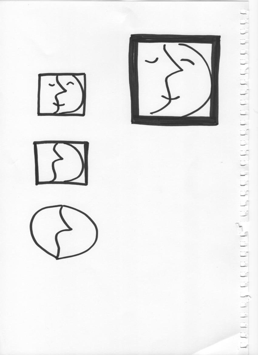
I chose my second picture from the painting details we had done previously and I picked the picture with the “ornamental” face on the top. I have some liking of this picture – might be due to the many nuances of yellowish colours that go into brown/mustard.
I decided to make an “all embroidery” image and worked continuously for several hours. I had made a rather big picture and I did have difficulties to find suitable blue colours. Unfortunately among my some ten different thread blue varieties there was none “primary” blue.
In reality colours are not quite as bright as in the pictures. I quite liked the result and I do think there is a nice colour balance in the picture with the yellow dominating but counterbalanced by the blue and black sides.
Painted detail from photo
3:
My third choice was to have another go at the postbox. I had some difficulties to source a suitable green – but found a silk that is not quite right, but with the additional stripes it works reasonably well. I enjoyed the result of the checked shirt fabric to depict the boxes at the side of the postbox, as well as the windows of the phone box being the postbox.
The pink phone box – I did not anywhere have anything in fabric that was in pink – but again a plastic bag. This one I covered by a sheet with silk organza and the result is quite right.
I placed a piece of bright orange in the two upper edges to symbolize the brick work that is present in a fairly orange colour in the very photo. It would have been interesting
I omitted the person in the upper left corner – might redo this piece when I have better time as it would be interesting to try it out in a Kettle style instead, with the person playing an important role in the picture. I think the colours go well and the mix of colours in the left part counter balances the bold red and black in the very post box.
Photo of letterbox plus market boxes
4 and 5:
My fourth and fifth are interpretations of the tomato picture. This is very bright green and red – could perhaps have been imaged like a road signal stop light. This I did not think of when considering how to play with this image.
My first is a ball dress with sculptured skirt and a green top with “lace in white”. However I did not have anything as remotely sharp in colour as the green needed to be – but I found some “crepe”-paper in the exact colour. I did some cuttings I it and inserted a stabilizing cardboard panel and stitched it onto the “skirt”. Not forgetting is a ball gown I found a fabric that was sparkly green with less sparkly dark grey ornaments from which I cut out a few little pieces, the tomato leaves” for the decoration of the skirt.
I did not have any padding but found old shoulder pads, and decided to keep the form which made the piece a bit more interesting – I thought.
I quite enjoyed this experiment – also while I had not previously done anything from this photo. I also think it works – these very strong, bold and complementary colours to balance each other. Interestingly enough – the red (as it should according to theory) brightens up still more with the little green sparkles on it.
Photo depicting a market stall
The next “tomato” experiment became a try to be a bit more “Joe Buddy” – it feels very pretentious to. However, I tried to find various reds, something which is much more obvious in the real piece than in these pictures which really do not manage to show the nuances of reds.
I inserted small “tomato leaves”
I also chose to make wholly rectangular pieces to see how that worked. The greens – are toned down by silk organza as well as tulle.
I did not manage to get a softly varied greenery at all but ata the same time it makes it a bit mote interesting. The colour contrast is still there and I made a try to see if the “tomato leaves” should be placed strictly in line with the other pieces, but decided to rather place them at different anagles – a bit more “scattered”.
This assignment included making textile interpretations of words, chosen from a list. We were to describe our associations with these words in mindmaps. My chosen words were: DENSITY, DELICACY, SCULPTURED, (in my case combined with STRUCTURED) and LACE.
I frequently did illustrate the words but also continuing to further develop the concept by first illustrataing the word but subsequently continuing to develop it further along with intuition or enjoyment.
Words describing a very wide range of materials create a mindset that opens up. I feel that a textile interpretation can include any of the mentioned materials, provided there is no limit as to how the interpretation is supposed to be used. In case a piece of a wearable interpretation a few of these materials would come out as difficult – such as copper and possible wax, paper depending on what paper and how it has been treated. I have myself experimented with news cuttings, backed by fusible
In case the intended interpretation is planned for a wall there are no limitations – and if the intended piece of work is to be placed outside, there have to be considerations – but no limitations – depending on how you can treat your material in advance.
My chosen words
DENSITY - my mindmap words were pleated, covered, layered, bricks, plastic, padded, felt, knots, together
I decided to make a dense layered brick like a “stacked” patchwork” from a huge number of patches of fabric – to make a firm brick which could be cut or “sawed” through. I used three different fabrics, warm brown, sharp turquoise and a dark blue-green/turquoise (a colour combination I like). They were very thin – they were of lining quality and I sprayed textile glue on them before I stacked them and continued to stack until I had a pile of 1,5-2cm thickness. It was difficult to cut through without distorting the cut surface and in the end I used a scalpel. I managed to produce one small brick and one large and what was interesting was that the shine of the brown fabric could be seen in the cut-through surface! I think I managed to really make a “dense” construction from textile – a real brick. The darker turquoise/blue did not really contrast enough compared to the lighter turquoise. On the other hand the band of light turqoise opposed the concept of density - however underlined the dense impression of the rest of the "stack".
DELICACY – my mindmap words were thin, transparent, disappear, see-through, holes, net, spiderweb, web, strengthen, caution, knotting
I did choose a polyester organza which has a faint sparkling character and I cut it up in thin ribbons making a “thread/yarn” from it. It did appear still more delicate when seen in these threads. My next task was to strengthen it. I crocheted a long line and became fascinated of how different it was – it had become elastic and one would not be scared of trying to stretch it. However in order to further strengthen it I tied it into loose knots and ended up with a knotted ball – which still has a delicate appearance but it is very strong.
I did not use colour in this experiment – I had initially some plans of colouring sections of the crocheted strand, sections in different colours but lacking proper textile dyes I decided I might just make a mess of this beautiful shimmering ball.
SCULPTURED but it could also be STRUCTURED – My mindmap words were soft, fluid, stiff, padding, hat, jewellery, folds, pleats, raised areas, quilting, bending,
I have always been interested in trying out origami and similar techniques with fabrics – have not done it until now. I have done some experimenting before in a small quilt but that was with soft fabric and this time I decided to use still polyester tulle that I had in store. I mixed it with yellow and turquoise lining fabric nd delieberately used black contouring not only to safeguard edges but also to make a couple of decorative seams. I wanted the black to break up the very “pretty, pretty” impression and give it a twist. The figures, flowers perhaps could be translated into larger or smaller soft chiffon creations either in colours or – in black on white, black on black or white on black, I can see a large chiffon scarf or even shawl with a rich decoration of this kind of crations. I can also see it in stiff creations as collars together with stiff pleated parts or as “overlarge” decorations on evening dresses.
LACE – my mind-map words were holes, filled holes, see-through, ornaments, sheer, bold, thread, wire, pattern, pearls, cut outs, mesh, web, net,
After some thought I chose to use a “winter” wool in brown with a tint towards olive and to make a bold lace, filled with contrasting colours. I cut out circles and squares and used a dark turqoise/blue thread to edge the pieces, but also used a lighter brown/beige thread for other edges. I entered both a warm shiny lining fabic as well as a dark bluish/turquoise fabric for a different type of contrast. In a piece of work of this kind, it is difficult to achieve a finish at high level. My lining fabric has bubbled and the contours are not perfect but the piece shows the idea and a way it can be done with appropriate fabrics. I could very well think of this kind of decoration on the back of a jacked or as an edging border of something.
This task included using a previous work done in earlier modules and make new interpretations of them and try to use learnings from looking into the great artists.
Matisse
I started to develop a combination of two previous own pieces of work, both from from Module 1. The first was an interpretation of the Assignment 5, here I had torn and rearranged a dishcloth and combined it with a “necklace” of flowers resulting from the same assignment, in addition I added and rearranged a painting from the same module but Assignment 6, of a three-layered silk of different colours and with a further different coloured warp that I had sewn in patterns and frayed. It became a “Matisse” painting, the first of which I thought became too pale, and then added a more saturated brown as background. I felt that Matisse frequently made black contours around his objects which I did as well. Unfortunately I do not think anybody would associate my painting to the Matisse style, but it was worth a try. The two paintings, the second with a darker background have unfortunately turned out differently in the photo colours, but the second is as “warm” as the first but the background is darker.
2. Miro
The second picture is also a development of forms and items from previous modules. The first results from Module 1, Assignment 6 and is a form captured from a painting of an “elastic” fabric, which I have developed further into the black and white module as well. The “faces” come from a painting/collage from module 2. I tried to make a combination which could be associated with Miro. He frequently used very bright colours with some little manipulations here and there – and I think that one might associate my painting with Miro’style. He used sometimes thick black contours in combination with the very primary colours.
3. Bridget Riley
My third pinting is supposed to be “a Bridget Riley”. I thought my oil pastel painting of the window sign, with the blue and green curved forms could be one to develop for a Riley “copy”.
Further artists:
Alexander Calder(1893-1976)
Alexander Calder was born in an artist family in the US. His father was a sculptor and his mother a painter. The family moved frequently but wherever they moved, Alexander had his own workshop from the age of eight, but when growing up he did not initially plan to become an artust. However during a journey on a boat as fireman, he woke up to see both a brilliant sunrise and a beautiful moon, an experience he is claimed never to have forgotten and shortly thereafter he started his artist’s career. He entered art school and was at one occasion in 1925 sent to cover circus performances for a magazine and circus became a life-long interest. Soon he moved to Paris and created “Cirque Calder” – a “puppet” circus which “performed” by Calder manipulating it.The figures were made from metal wire, bits of leather and wood. Each piece was smalal enough to be packed, and soon he was asked to run the perfomances both in Paris and New York.
Gradually Calder developed this style, he also mixed with the artis groups in Paris – as well as New York and he went on to create mobiles – at first motored mobiles – but later mobiles where the figures moved by the air stream. The very figures and constructions were made from sheet metal and wire, and one can easily see influences (who influenced whom?) in the work of Miro – and Calder and Miro knew each other.
Calder is known also for big mobiles, one of them is International Mobile, for the Philadelphia Museum of Art's Third International Exhibition of Sculpture. It was created in 1949. He also created mobiles for a play and for a dance performance.
Calder was always working and exhibiting both in Europe and in the US and was one of the most prolific artist ever during his life.
Yves Klein (1928-1962)
Yves Klein was French whose parents were painters. He was born in Nice but moved later to Paris. As many of his contemporaries he did not start out to pursue an artistic career, but rather a business training as well as language studies. He soon started to paint and in 1947 he created his first “Symphonie Monotone”. He continued to produce almost exclusively monochrome paintings, and at first he used several different colours, whereas towards the end of his short life he painted in lue, deep and dark blue. He has been classified as “neo-Dada” as well as a “Post-Modernist” and he founded the “New Realism Movement together with the art critic Pierre Restany. Yves Klein died at the age of 34 from a heart attack, but is considered to be an important artist in the post-war art scene.
Anish Kapoor ()
Anish Kapoor is Indian by origin and was born in India in 1954 but moved to UK in 1972 where he was educated at the ChelseaSchool of Art. He is a sculptor and attracted attention for a very innovative range of works. He travels frequently to India and is inspired by both Asian and Western European culture. He works at a big scale and uses simple forms, usually monochromatic and often in bright colours.
His earlier works are coloured by pigments, and the floor surrounding the piece is also covered.Inspiration comes from Indian spice markets and temples. Later works are made from solid stone. During the last decade he has produced several very large sculptures, one of them being “Tarantara”1999, which is 35 meter high and is installed in the Baltic Flour Mills in Gateshead, before renovation began there . Another is “Marsyas” installed in the Turbione Hall of Tate Modern in London.
This assignment included looking at some of the great artists, among them Paul Gaugin, Georges Seurat, Henri Matisse, Mark Rothko, Jackson Pollock, Bridget Riley, Joan Miro.
Paul Gaugin (1848-1903)
Paul Gaugin was born in Paris, his father was a journalist and his mother half-Peruvian and daughter of a socialist activist and feminist in Peru. When he was 3, the family moved to livein Peru but his father died during the journey. His mother, his sister and himself then lived with an uncle in Lima for four years before they moved back to France and as a young adult he joined the French navy before he started a career as a stockbroker. He married a Danish woman coming from a high society family. He had five children with her, they lived in Denmark for a while but eventually she left him and he returned to France.
Paul Gaugin had a life as colourful as his paintings. He is one important representative of the“Fauve” movement. I visited the Tate exhibition last year and I love his paintings, not the least due to the bold way he frequently painted. I also like his intensive and bold use of colours. I have also been fond of his way of making his art look a bit naivistic – even if the naivism or primitivism is very cleverly carried out.
His Peruvian inheritance has affected his painting to some extent – but the most generally known part of his life, is from his periods in Tahiti and the Marquesas Islands – where he died from syphilis. He is known to have been living with very young girls in the Polynesian islands some of them being depicted in his paintings but there is also research defending his way of life, as that of the local culture.
Gaugin’s paintings are colourful, also his earlier work. He seems to use rather thick colour when he painted and the brushstrokes are possible to see in many of his paintings – especially in his later work. He had a relation with van Gogh, and stayed and painted with him for a few weeks, just preceeding van Gogh’s hospitalization and the story of his ear is claimed to have happened after a row with Gaugin. The influence can be seen in the painting of the house.
The later paintings, those of motifs from Polynesia, frequently use intense red, yellow and green colours – as blue but frequentlythe warm colours are dominating. Gaugin exerted a huge influence on his contemporaries, Picasso was one of them.
George Seurat (1859-1891)
George Seurat was born in Paris and started to take drawing lessons from the sculptor Justin Lequien and painter Ingres. He was also a student of Jean-Louis David. He might have been influenced in his meticulous style of working, by Ingres.
Seurat is known for having developed the art form of “Pointillism”. He was passionate of colour theories and of the effect of different linear structures. The Pointillism used little “dots” to created the overall impression of the colour composition and the very colour of the dots were not (in his art) mixed as he wanted to depict the “purity” of colours.
When he entered the art scene with his paintings loking quite different, many were opposed, however he had a strong supporter in the artist Paul Signac.
Signac commented on the pointillistic paintings and pointed out the importance of color purity in each brushstroke. Seurat is said to have invented a way to show what the colours really are like, and the optical effect of the mix of the “dots” of the pure colours side by side of each other.
He was also interested and fascinated by the effects of lines in the overall composition and he is said to frequently have sketched his paintings first as drawings on a geometrical grid. Painting number two and three (above) also show one of his known passions in a very clear way – that of how lines affect paintings and compositions. The third painting, “A Sunday Afternoon on the Island of La Grande Jatte” is his most famous painting and it took him two years to complete.
Seurat died in Paris in 1891 only 32 years old from an infection, most probably diphtheria, and his son died just two weeks after himself, possibly from a similar infection.
Henri Matisse (1869-1954)
Henri Matisse was born in France and grew up in Picardy, north of Paris, and his parents owned a flower shop. He initially studied law and worked at court. He did not start to paint until he was 20 years old, and he soon decided to become a painter. In 1991 he started his studies at “Academy Julian” in Paris and initially he painted in a “classical style”, mainly landscapes and still-lifes.
In 1997-98 he visited a painter called “John-Peter Russell who lived on an island outside Brittany where he was introduced to the Impressionism and actually to the work of Van Gogh.
He changed his style of painting completely and started his development into making very colourful paintings. For a few years he painted in the pointillistic style after being inspired by Signac, and at the time he bought a large number of paintings of contemporary artists, of which Cezanne became asubject for him to seek inspirations from.
Subsequently he got together with several artists later known as the “Fauves” (“wild beasts”) who painted in bright and bold colours and usually using colours for their motifs that had no resemblance with the true colours. The colours were also often in dissonant contrast. The second painting below, “Woman with a hat” was an important piece of work, exhibited and attacked but later bought by an important art dealer. Matisse became the leader of this group of Fauves, but later became a good friend of Picasso and they followed each other for many years.
Mark Rothko (1903-1970)
Mark Rothko or rather Marcus Rothkowitz, was born in Russia to Jewish parents but moved as a child to the US, in the wake of anti-semitism in Russia. His father died shortly after he and his mother and elder sister had joined his father in the US, and the family had difficulties to support themselves and all three of them had to contribute by simple jobs.
He won a scholarship for studies at Yale university but quit in his second year and moved to New York where he initially financed his living by work in the garment industry.
At this time he started his artistic development and in the beginning one of his tutors was Max Weber, who influenced him very much and made him realize that art could be a way of expressing emotions and religious feelings.
His first one-man-show mainly consisted of portrait paintings and gradually through the years he painted urban motifs, and he also had a surrealistic period as well as a mythological, until he gradually developed his signature style – the fields of colour that interact by the colours themselves and create different kind of light. In between he had a transitional period when he developed more and more into an abstract style.
One of his most famous paintings, No 18, depicts one field of black and one of warm orange. The fields are surrounded by a more brownish/black blurred contour.
In the beginning of his “multiform” period, he used vibrant colours, often reds and yellow, whereas in his later period employed darker blues and greens, greys and black – claimed to mimic his increasing dark mood..
He is claimed to have experienced not to be quite understood by critics but also by those viewing his work, and he felt it was difficult to explain that his paintings were expressions of deep emotional basic feelings. In the end of his life he created Rothko Chapel, which would need another few pages to describe – however a very interesting story as it was to be devoted to Roman-catholic beliefs.
Summary – the signature work of Rothko are usually quite strong or intense in colours and almost always the contours of the normally rectangular, horizontally placed fields of colour are blurred by using different nuances of the same colour . He usually uses 2-3 fields, sometimes intersected by one quite contrasting thin field of another colour. He usually employs only one or two colours but contrasted with a nuance of the same – eg yellow/orange or orange/orange-red; or blu/blue-green etc.
Jackson Pollock (1912-1956)
Jackson Pollock was born in a farmer’s family in Wyoming, US but the family moved many times during his childhood. Pollock was not very interested in art or drawing during his youth and first at high-school a teacher opened his eyes for art. In 1930 he moved to New York and enrolled in art school. A teacher there was very “anti-modern” I his teaching and a few years after leaving art school Pollock started his journey in modern art. He also, partly due to his former teacher showed interest in mural art and he attended workshops. He was employed in a federal art project in the mid-thirties till 1942and worked subsequently as an easel painter. He had started to develop alcoholism and had a break-down during these years.
In the beginning of the forties he was introduced to Lee Krasner who introduced him to the inner circles of the New York art world. They subsequently married, and she encouraged his career and put her own on hold. He was introduced to Roberto Matta who encouraged him to introduce new techniques to allow for accidental effects and to allow for risky developments in his paintings. Subsequently he was also introduced to Peggy Guggenheim, an encounter which allowed him to concentrate more on his developing art work instead of having to support himself by smaller commissions.
In 1943 he had his fist solo exhibition in Guggenheim’s gallery; “Art of This Century” and one of the paintings was“Male and Female” (First painting below) and it is possible to see he has started to experiment with his famous dripping and splashing technique, something that was to become his signature style.
Splashing, dripping and pouring became synonymous with Jackson Pollock and the paintings that made him very famous were painted within a short period, mainly 1947-1951.
Pollock died in a car accident, with himself behind the wheel and drunk after a fairly long period of abstaining from alcohol.
His signature technique and style included splashing and pouring usually thinned paint, with the canvas stuck on the floor with himself then accessing the painting from all sides. He also used basting syringes. He frequently used enamel to paint with and the “Cathedral” was painted with enamel and aluminium on canvas. He sometimes also introduced objects into the thick layers of paint to produce a further change to the texture of the painting.
Bridget Riley (1931- )
Bridget Riley born in London in 1931, is a leading “Op-Art” artist. She is educated at GoldsmithCollege as well as Royal College of Art. In her early thirties she began to paint optic art in black and white. She exhibited in 1965 in Museum of Modern Art in New York, an exhibition which first attracted attention internationally to her work. Her painting “Current”1964 (first painting below) was used for cover of the catalogue of that exhibition.
She started soon after to explore colour contrasts after having become “disappointed” by the op-art as having become too commercial. She travelled, one of her several journeys was to Egypt which made her fascinated by the hieroglyphs. In 1968 she represented Britain in the Venice Biennal, and was the first British contemporary painter, and the first woman to be awarded the International Price for painting.
In current days she uses others to do the very painting whereas she herself makes the designs.
She seems to use mainly paint on canvas but she creates in her different works all kind of Itten’s colour contrasts. What strikes me about “Shadows” is that there does not seem to be any of the primary colours adjacent to each other. I can see only a few obvious primaries side by side by its complementary colour – in the almost upper right corner one finds blue side by side with orange. On the orher hand there she has emphasized the contrast by then pairing the blue with what seems to be black. I can see red (if it is red in reality) paired with green. At several places she has used different nuances of the same colour – blue/turquoise, orange/yellow/red. She has used both black and white to “break” the colours and that does create a life in the painting.
In the third painting which is a huge painting that is a mural in reality, she has used what I believe are colours diluted by white or grey. I do believe that the blue and green might be primary colours that are diluted by white, and connected to that is a diluted orange that is much less in abundance than the blue green. Could Itten’s rules be found here? A smaller volume of a complementary, orange against blue even if they are diluted? She has also used form in both of these colourful paintings – in the shadow play, she has used one single unit, a rhomboid, that she sometimes has multiplied. They are always exactly side by side, and the pattern is created solely by the contrasts between colours. In the last painting she uses rounded rhomboids together with pointed ellipsoids and rounded triangles in a clever composition.
Joan Miró (1893-1983)
Miro was a Spanish artist, born in a family with a long and rich history of craftsmen. His family included a blacksmith, a watchmaker and his father was a well-known jeweller. He started drawing lessons at a young age and at 14 he enrolled at an art academy. During his years he lived in Paris, Barcelona but also in Mallorca where he lived for his last thirty years as well as when he died.In Mallorca there is a museum which houses more than 6000 (!) pieces of work by Joan Miro.
.
In his early twenties he moved to Paris and was introduced to the rich art scene of the time, and he – even if he was to be the leading surrealistic painter he did not want a label. Miro is known to have been quite experimental during his whole career and towards the later part of his life he used mixed media increasingly. Miro produced over a thousand prints by help of a printer in Paris by he also became a sculptor and he produced hundreds of ceramic pieces of work. During the last years of his life he was even talking about gas sculptures and four-dimensional painting.
In the surrealistic movement, “automatic drawing” and automatic painting” was an important technique, also very representative of Miro’s work. In a fully automatic way of drawing, where no representation of any motif is involved, your hand with the brush or pencil is moved by your subconscious mind. This means that marks and lines and whatever interruptions are seen as a product of your subconscious inner feelings and experiences. However most of the surrealistic paintings are supposed to be “illusionistic” where any represented motif has “suggested itself.”
Below there are three paintings by Miro from different time periods. The first, a still life reminds me very much of Matisse whereas his later work is very much Miro. It strikes me that he uses black to quite an extent to really underline contrasts even where he uses many of Itten’s obvious laws of contrast. In addition he uses black in combination with strong, frequently primary colours along with green. A further feature I feel is that he often uses soft roundish forms which to some extent also creates a contrast to the colours he uses, particular in his “signature” work.