Mid-June when I was working frantically in order to by-pass my problem of having holidays in July, whereas smost England as well as the tutors have holidays in August. I was almost desperate to be able to start the degree course of Julia Caprara school in September and there was a lot of work to finish - really a complete double work till very late night.
At the time I was about to finish the "Colour Module" of the course and - as I had planned to say (one of the other degree students as well) to the author of the course - this module was rather an almost full-time course than a 15 hour/week course - it was very demanding indeed! This was the first ever predegree course of the school - and they were anxious to have our views.
However, I had strangely little back when trying to contact the school and had begun being very irritated - indeed and - finally the blow - the school filed for bankrupcy!
Well - the stress was over for the time being but I was so disappointed, so very disappointed. I had enjoyed this course immensely and I felt I really was "discovering" my creativity or rather was stimulated to let it out to be developed.
Showing posts with label Creative diary. Show all posts
Showing posts with label Creative diary. Show all posts
Aug 23, 2011
Jun 3, 2011
Chairs - very full covers
I saw chairs in a restauraant the other day. "Normal" chairs had been given a cover from plywood. They were flat covers for the legs - which could be made from fabrics instead. I saw immediately brightly coulored covers, stiffened by stuffinf or padding - or by some structured support. Red-green-yellow stripes horizontally - stripes unevenly wide - could be quite fun!
May 24, 2011
Beautiful bridges
During my journeey through Europe, we passed a couple of beautiful bridges in Denmark on our way to Sweden. The most known of them today iss the bridge between Denmark (Copenhagen) and Sweden (Malmoe). From the Danish side it starts with a tunnel coming up onto an artificial island, and continues on a brideg, the pylones of which are the highest buildings of Sweden. (Over 250 m). This bridge from different angles togehter with other bridges during this journey inspired me to think of an image with the sea and the sky with the cables ("threads") from the pylones. Yes - there will be time sometime!

Lorries on Motorway
Travelling through Europe by car, and just transporting ourselves from the UK to Stockholm - we were going monotonously hour after hour on the motorways all the 1950 km. Along the way - the most fascinating scenery plays at you on the motorway. In the right lane, there is a continous line of lorries seen from behind. Starting to imaagine the different colours, texts and forms - most of them are fairly similarly rectangular seen from behind but all od a sudden a lorry with a concrete mixer turns up in the line which breaks the strict graphic pattern. Many of them are white or off-white but mixed in an amusing way with bright red, bright blue and other colours. If green the lorries are usually rather dark green but the newer ones seem to be more strongly coloured.
I think one could make a great collage or textile interpretation with these rectangulars overlapping each others in long lines - and with the occasionaal breaking out to overtake another.

I think one could make a great collage or textile interpretation with these rectangulars overlapping each others in long lines - and with the occasionaal breaking out to overtake another.

May 3, 2011
Arty charitable elephants
When passing Copenhagen airport, there is an exhibition on the way to security check. There are two elephants which are lovely. Artists have been invited to make elephants which will later go into an exhibition of some 100 elephants which will be auctioned for charity. I have attached the two on show in the Copenhagen International airport. I think they are great!


Apr 28, 2011
New large cushion covers
I have spent a week renewing cushions on sun chairs etcc in our French house. I have not had very much time which means that I had to go to the market to find fabrics, and to use old foam filling for them. I made some brown cushions, with some stripes in lighter brown for the rattan group and was quite content. I have also made some whitish cushions for a couple of very old rattan chairs that come from my childhood home. I washed and cleant them and will see this summer if they should be treated by some oil. They are minimum sixty years old whic is qquite impressive. I have attached a picture - and the cushions I made will only be used for now. I am plaanning to make some more "Provencal" and "art" -- when there is time because they deserve that I think!
The Sun!
In the south of France there is normally bright sunshine contributiong to the special light so loved by artits. When being in the ssouth I have always thought of creating pictures or images of the sun. Golden sun, orange sun, stara shaped sun, several suns, cascades of rays, strict rays ertc etc. I have never come as far - but the ideas are there, bouling and maturing .. so who knows?
Apr 21, 2011
Sand, sea and pebbles
I have frequently thought of creating a series of pictures, textile pieces or collages of the sand beaches with its pebbles. I have planned to somehow include real sand - of different nuances and coarseness. pebbles can be made from textiles or be embroidered - or be made from paper or orher material. The important thing is to capture the different colour of sand layers on a beach - the mix with algues and pebbles that form the bands of colour along a beach. Hopefully one of these days I will have the time. The ideas might also continue to develop in the head - perhaps for another few - or many months!
Apr 20, 2011
Easter in Sainte Maxime-Provencal fabrics do not work in a different environment
I went to Sainte Maxime for Easter where we have a house since a couple of decades I do some sewing there as well, I have a sewing machine and - as everywhere a certain stock of fabrics in the wardrobes. I knew we were going to do "ethnic" coloursand fabrics in our third module and I decided to at least bring some photos of the Provencale fabrics I have there.
I have always seen the Provencale fabrics and colours down there and during the years I have tried to bring back a table cloth or a cushion cover - however it does not normally work in the Scandinavian - nor the English environment. Somehow the colours don't go - hardly even on a garden table in the midde of the summer. Somehow the designs dod not really work either and especially not in the Scandinavian environment of today. So - I have left them down there!
I have always seen the Provencale fabrics and colours down there and during the years I have tried to bring back a table cloth or a cushion cover - however it does not normally work in the Scandinavian - nor the English environment. Somehow the colours don't go - hardly even on a garden table in the midde of the summer. Somehow the designs dod not really work either and especially not in the Scandinavian environment of today. So - I have left them down there!
Apr 6, 2011
Sue Timney - super black and white designer
I visioted the Fashion and Textile museum in London this last weekend. There I was really struck by a super exhibition about Sue Timney and her textile design company "Timney Fowler" which was a joint company and collaboration together with her second husband Grahame Fowler. Her designs were usually quite bold, very graphic prints in black and white and she played a lot with graphics interaction - n particular in the beginning - already in her degree show from Royal Academy of Art. One of her most famous icons is prints of Roman heads but also other Roman architectural features, frequently intermixed with modern and contemporary designs. I think one could decribe her prints and textiles as classic with a bold contemporary edge. I loved her textiles - the designs are used for all kind of textiles but also China, prints on shoes, on stationery but nowadays she mainly works with interior designs. She also works in bright colours nowadays and obviously is represented by the "big" players in the market.
The exhibition was extremely well made and I became really very inspired!


The exhibition was extremely well made and I became really very inspired!


Mar 31, 2011
A first try to paint and print
I decided to make a first try on silk crepe by just painting inside a stencil cut our from newsprint paper. I used silk crepe and initially used dye with thickener in it in order to have some more firm contours. I proceeded by painting a lighter gery with sye without thickener in order to make it run -- and it did bleed profoundely. Subsequently I had planned to paint very thin lines of shocking neon colours of pink, green and turquise as well as yellow - however that did not work out quite as I had planned. The lines did not become as straight and defined as I had wished for and the colours did not at all become as striking as desired. Anyway, I will proceed to make a scarf - actually it did become rather fun and contemporary.


Another printed masterpiece
For my course at West Dean - I had brought a suitcase with finds from the bottom of the moving boxes in my treasure grove in the basement room. (that has been transformed by natural forces - so called acts of God) from a guest room to a room littered with fabric piles - right now black and white).
I had found a jersey that I realized was a silk jersey - and hence i smashed it ontio the printing table in the morning of departure day. All work should be finished by 12 - and I realized Carole needed to have some margin as we were supposed to have emptied the studio by 3.30.
So - inspired by my little line figures - a "dancing couple" I proceeded fast to draw some minimalized figures onto newsprint paper in order to produce my stencil for the printing frame.
I quickly contiinued to print black parts and when dry, some grey images. Had I had time I would probably made a further print in stuill ligher grey. But - I hope to be able to make a small soft blouse/jacket with shortsleeves.
 | ||||||
| Silk jersey on printing table |
Ann-Marie back to printing
I went to West Dean College - and wow - it became a fantastic journey. Being a teenager I did print my festive outfits, several dresses I remember and particularly my ball gown for the final ball held when we finished school, and passed "Studentexamen" a big event in Sweden, sijmilar to the International Bac.
Anyway - I immediately put my name down when I saw that Carole Waller was to hold this course and I did not become disappointed. We were ten pupils, all of them with some diploma or degree - or on their way to some degree. I do think I was the least "qualified" but interestingly enough the only that had some focus on textiles for clothes. Everybody introduced themselves and Carole paled a bit when I declared that I wanted to go home with a printed silk chiffon for a tunic. It was a four day-course - in practice three and a half and we worked late hours and I loved it. I was particularly interested as we were to use "translucent colours", something I was not aquainted with before. I had only done lino printing on cloth before (45 years ago)- but silk screen printing in my job, when I invented to print chemicals onto paper in a controlled way in iorder to produce complicated disgnostic"test strips" for veterinary medical use something which rendered me a world patent - also some 35 years ago. The funny thing was that the first examples of those prints were done at our kitchen table with my "hobby" sild screen frame that I had wished and got for Christmas!
Very well - I learnt on this course many more ways of producing prints using the frame and I was the only of the students who did not produce a photostencil at site. i reasoned with rationing time- as I will never be able to produce a photo stencil at home - I will anyway be depending on having sombody else to make it - so - I continued to make my paper stencils for printing my chiffon tunic. Having printed a rather bold, "Marimekko"-style pattern in turqoise and yellow, I wanted to soften it up with some grey. Being a bit uncertain of what kind od form to use, Carole suggested bold, wide, daring pbrish strokes all over..... And so I did - large arm movements and it turned out beautiful! I was so happy! I will make a posting when the tunic is made.
This first image shows fabric on printing table - and the colours seem quite bold - however after steaming to fix the dye as well as subsequent washiing out of the thickening agent in the dye, the colours become much less sharp and quite translucent.
The second image shows the fabric hanging, it has been steamed but still not washed and it is first after the washing that one can really see what the colours became like.
Anyway - I immediately put my name down when I saw that Carole Waller was to hold this course and I did not become disappointed. We were ten pupils, all of them with some diploma or degree - or on their way to some degree. I do think I was the least "qualified" but interestingly enough the only that had some focus on textiles for clothes. Everybody introduced themselves and Carole paled a bit when I declared that I wanted to go home with a printed silk chiffon for a tunic. It was a four day-course - in practice three and a half and we worked late hours and I loved it. I was particularly interested as we were to use "translucent colours", something I was not aquainted with before. I had only done lino printing on cloth before (45 years ago)- but silk screen printing in my job, when I invented to print chemicals onto paper in a controlled way in iorder to produce complicated disgnostic"test strips" for veterinary medical use something which rendered me a world patent - also some 35 years ago. The funny thing was that the first examples of those prints were done at our kitchen table with my "hobby" sild screen frame that I had wished and got for Christmas!
Very well - I learnt on this course many more ways of producing prints using the frame and I was the only of the students who did not produce a photostencil at site. i reasoned with rationing time- as I will never be able to produce a photo stencil at home - I will anyway be depending on having sombody else to make it - so - I continued to make my paper stencils for printing my chiffon tunic. Having printed a rather bold, "Marimekko"-style pattern in turqoise and yellow, I wanted to soften it up with some grey. Being a bit uncertain of what kind od form to use, Carole suggested bold, wide, daring pbrish strokes all over..... And so I did - large arm movements and it turned out beautiful! I was so happy! I will make a posting when the tunic is made.
 |
| Silk chiffon tunic - still on printing table |
 | |
| Chiffon steamed |
Mar 23, 2011
Organza spirals
Being inspired by some pottery work in a Cambridge gallery - where there were two ceramic light coloured spirals mounted on a wall board. The spirals exposed the reliefs of a face, one each. My thoughts were - as I have played around a little bit with geometrical figures of paper, perhaps I could use organza, printed or stitched on both sides - in separate positions and make spirals of organza - perhaps organza ribbons? This way they could be arranged to expose on their "front" or towards the bottom of the spiral - faces or other figures I would like to show - more or less. It would create some curiosity and desire to search for images in the display.
Hope I will have time!
Hope I will have time!
Degree show favourites
I went to the Julia Caprara school degree show in Shoreditch jusst after it had opened. I loved to see artists now being able to boast being "fully educated artists"! There were a fw that I loved for various vreasons and I think the two that impressed most was the Canadian artis who had made paintings on silk organza which were hanging freely a bit from the wall. They seemd to be influenced by nature and they were gorgous. They were subte and at the same time clourful, one even with golden spots. There were just a few well placed stitches to "break up" the painted surface. They also gave a very delicate impression - due to the material but also the way they were painted. Beautiful!
The other that also was strikingly beautiful was the embroidered "tree trunk" The artsit had managed to embroider both a standing piece of a tree trunk and a lying trunk. It was very dark brown with a world of nuances and some shine and sparkle in between. Beautiful as well as the pieces were quite big and quite impressive.
The third that Ididlike was the series of old-fashioned advertisements fully embroidered. They were fun and were impressive pieces of work.
I was not quite as fond of the feministic installation even if the bikini made from condomes was quite creative, but otherwise i felt that the way the different pieces were made, (crochetedainly) was not that impressive.
Also I did notlove the"altar" piece even if it was a very wide series of different techniques inserted in this piece.
Mar 16, 2011
Module 2; Assignment 5:1; Motifs and Multiples
I like the concept of repeating patterns building up an overall picture and impression and I enjoyed the printing exercise in the end of the assignment. When looking at some blackwork embroidery it is so rich -almost as to cover the fact that there is a repetitive pattern.
When looking a bit into Bauhaus black and white studies – I became slightly surprised as I had believed that the Bauhaus movement was quite a strict “functional” and to some extent minimalistic movement. There were several pictures being quite rich and with my absolute minimalistic experience of art, I got impressions from both Chagall, Matisse and Miro when looking at a few. On the other hand – studies of buildings and architectural motifs were more strict. To remind me – the “Bauhausers” were contemporary with the artists I mentioned above.
Looking into the ethnic patterns, African and Uzbekistan, it is an interesting thought that I believe that all cultures have used the technique to repeat patterns – carpets – kelims and virtually all oriental carpets and textiles; kurbitz (Scandinavia), well I guess I could get on.
The factor of rhythm I have never really thought about or noticed (or rather been made to notice). However, I do guess that little wall cabinets with finds from the beach or from nature that you would find in most homes – not the least homes with children, are a parallel to the example of Damien Hirst in the course sheet.
Task 1: Patterns on paper and fabrics
I have collected – bought a few pieces of materials displaying a variety of black and white pattern, and I will make o few comments for each of them. However, I will not cut out a piece of them – as if I do, I will not be able to make o scarf from the pieces, which I will actually be able to do from four of them!
a) Rich pattern, black on white polyester
This fabric is a bit “crepy”, by means of minute pleats in the structure. It is see
through, chiffon like.


It is not very beautiful, but it is built up from a large number of patterns, lines and marks. The dominating feature is a flower which is in turn built up from several mall patterns included in the petal leaves. This flower is repeated – and is repeated in inverse colours as well. There is one further large structure, also a flower with a further large number of small lines and marks filling its different structures. This flower structure is repeated, but every second repetition is broken by the insertion of flower pattern number one.
Spaces between these flower structures, in four different varieties, are filled with a smallish pattern, sometimes in two directions. In addition, one discovers there are a variety of independent patterns of leaves and flowers, filled with an independent pattern of lines. Not until one really analyses the number of “bodies” and pattern components, one realizes how many they are. I believe there are about ten principal components – in addition to about as many principal basic patterns of lines and marks.
b) Black and white cotton with large pattern components
This fabric is a cotton satin, very white and very obvious and large pattern groups. There are some very black components and hence a rather “unruly” impression.
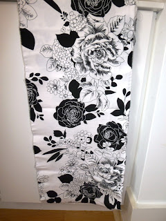


There seem to be some five main black flower components, and about five different white flower heads. There are a large number of different leaves, black and white with different marks on them. In addition there is a large variety of smaller flower bunches and “grapes”, but also individual and independent smaller flowers.
c) Cream silk (or poly) with one principal repeated black pattern


This fabric includes one principal component, but it is itself built up from several individual pattern components, arranged in a group to form the structure. There are about ten different smaller marks, lines and figures used to build the pattern structure. I feel the fabric has quite a rhythm and a softness due to the slightly “subdued” background in combination with the “brush stroke” character of each individual mark.


d)Black viscose crèpe with circle white print


d)


This is an amusing pattern, as I have tried to find the structure, or individual component repetitive structures used to build it up, but I have not quite managed. Of course the obvious – different size and form of the circles – but otherwise difficult to see. One can identify a few bigger clusters, kind of flowerlike, but as soon as one tries to find more, the eye or brain gets confused. Also diagonal strings of intertwined circles – yes – as straight lines of them – yes but still the repetitions are difficult to find.
a) Simple small patterns repeated in several larger geometrical clusters
The last fabric, a light fluid cloth of crepe character is patterned by two simple rectangular types of small patterns, varied by colour inversion and combined by scraps of lines, and one type of circles and wavy lines, also varied by inversion. In addition there is a zig-zag pattern, also inversed. These patterns have been gathered in rhomboid areas and a fairly rich pattern has been built by simple patterns and marks.
Mar 10, 2011
JC workshop London
I participated in the JC workshop in London the 8th of March and enjoyed it very much. It was really a workshop for degree students to practice presenting skills. I was pretty amazed by the widely varying concepts and outcomes from the different students, also by them in the same module, ie presenting an outdoor/indoor installation. I was particularly fond of the presentation about an indoor installation in the premises of the National Archives, as well as an outdoor piece at a slate mine. Another that caught my heart was an outdoor piece in a remembrance park in addition to a "matching" piece to place indoors. A further presentation that I fell in love with was an exhibition of what can be achieved by folds and pleats. This student/artist; Catherina pinpointed precisely my own fondness in pleats and folds, or what you can find hidden behind doors. I had myself already planned a piece for my last task in module 2, a piece of hidden and exposed images in curls of printed organza. I became quite encouraged by this.
Mar 3, 2011
Module 2; Assignment 4; Minimalism
ASSIGNMENT 4; Minimalism
Donald Judd
Agnes Martin
Dan Flavin
Robert Morris
Frank Stella
Carl Andre
Robert Smithson
Sol LeWitt
Richard Serra
Donald Judd
Donald Judd, American, started the pure square and rectangular forms (1928-94) in the beginning of the sixties and did not call his work sculptures but “specific objects” and he worked during his last decades with very industrial materials, such as concrete, plywood, industrial co§lour impregnated plexi-glass and metals. He also was of the opinion that no signs of the artist’s hand or actions should be at all visible, which meant that his works were manufactured in factories according to his exact drawings.
In his later years he also worked with furniture, design and architecture.
Dan Flavin
He was a Jamaican who lived and worked in the US Korea he started to study art and continued when he came back to the US
Robert Morris
Born in Kansas , US in 1931, he first studied in Kansas but moved to New York Japan and Korea
Robert Smithson
Robert Smithson was one of the founders of Land Art; Earthworks. He also worked with photo and film. One of his most famous creations was the “Spiral Jetty”. One of his most prominent concepts or themes, was entropy – and explored his thoughts in “decay and rebuilding and in chaos and order” – concepts or rather processes with an inherent entropy. He made asphalt pour down a slope, he placed and displaced mirrors in bush and in earth, he half-buried a shed and this is Land Art – a post-minimalistic movement. He also created the concept of “nonsites” (an indoor earthwork)– and one example of this was his first nonsite: Nonsite - Pine Barrens, New Jersey. He also worked with the concept “Displacement” – which included work by placing mirrors in the environment – and later removing them. He created photos depicting the process of making his earthwork but also films.
Sol LeWitt (1928-2007)
He was born and grew up in Hartford , Connecticut Syracuse University he went travelling to Europe and later he served in the Korean war, went to Japan and returned to Korea New York and set up his studio at the same time as he studied at the School of Visual Art New York
LeWitt is regarded as the - one of the founders of Minimalistic Art as well as Conceptual art.
LeWitt has been enormously prolific. He has produced hundreds and hundreds of wall drawings, of which 1200 have been executed, and he has produced gallery size pieces of art to huge outdoor works. The cube was a paramount base for much of his work and he has produced some 50 artist books. LeWitt was contemporary and inspirational for most of the known abstract and minimalistic artists, such as Robert Smithson, Carl Andre and Frank Stella.
Task 1: Two Minimalistic artists – three dimensions
Carl Andre (1935-)
Born in Quincy , Massachusetts Massachusetts Europe , he worked at a steel work as well as on a railroad and joined the army. His work is “very minimalistic” and he excels in creating pieces of art based on mathematical relations and philosophy. A famous sculpture was “Equivalent VIII” which was a “pile of concrete bricks laid out on the floor”. Most of Andre’s sculptures are creations on the floor or horizontal with the floor. The Equivalent VIII was purchased by Tate Gallery, or rather he created a new for Tate, and this acquisition was widely debated by media. Andre has said: “My art springs from my desire to have things in the world which would otherwise never be there.” The name “equivalent” springs from the fact that he produced a number of installations/sculptures consisting of 120 firebricks, arranged in different ways, but with the same height, mass and volume – hence “equivalent”.


Another known installation is “Stone Field Sculpture 1977” which consists of 36 rocks placed on a triangular lawn, in Hartford near Main . A further known work of Carl Andre is “Lament for the Children”, 1976. It consists of 100 concrete blocks placed on the floor in rows.
Carl Andre was contemporary with Frank Stella, they had even been students together at the Phillips Academy , and during a couple of years in the end of the fifties they even shared a studio in New York
In 1988 he was accused of having murdered his wife, an artist, Ana Mendieta, but was acquitted of the murder.
Richard Serra (1935-)
He was born in San Francisco University of California in Berkely and also Santa Barbara
He started his art studies at the Yale University School of Art and Architecture and continued later overseas where he studied both in Florence and Paris New York
His major works are produced from “Cor-Ten Steel” and he has worked with big rolls as well as upstanding sheet metal, and often his sculptures are self supporting. The material rusts with time but gradually the rusting stabilizes.
In 1981 he was commissioned by a public Art-in-Architecture programme” to produce a piece of art for the Federal Plaza in New York

Bilbao

A further famous work by Serra is his sculpture “Snake” – a mammoth sculpture with its permanent place in the Guggenheim museum of Bilbao
Serra is used to create debate, one commission for Madrid
Most of what he does and has produced is giant pieces of work. My personal feeling is ambivalent. Most of his work I think break and create contrast with the environment where his pieces are placed and I can understand that he is controversial. However, I am quite fond of the material he uses, I think it is beautiful in its simplicity and a few of his pieces of art I also like a lot. I do like the “Snake” in My own minimalistic sculpture:
ANN-MARIE’S MINIMALISTIC TUBE STEPS
Walking with a crutch in London

I became inspired by these steps, and in addition I had already found in my basement treasure grove – two thick sheets of dark grey rubber foam with a tight and heavy structure giving a raw and “industrial” feeling. Hence my proposed piece would be a combination of this foam rubber and another “industrial” raw material, white Styrofoam, with “bricks” as well as thin sheets of both materials, glued together in a staircase. I have omitted the imprints on the edging metal bricks – this minimalistic impression is supposed to be freed from any decorative matter.
I do feel I have captured the “minimalistic” and industrial feeling in this piece of work and I also feel the symbolized staircase steps in the tube, are a further good base for my minimalistic sculpture. I quite like my proposed work - however again -my perspective is not the best.Frank Stella (1936--)
Frank Stella was born and raised in Massachusetts but moved to study at Princeton University New York
In the middle of the sixties, he started printmaking and produced his first abstract prints, using silkscreen, lithography and etching.
Already in 1970 he was honoured by a retrospective exhibition at the museum of Modern Art
In the mid-eighties he started to do sculptures, or works in three dimensions for display in public places. Among other commissions he has designed the Princess of Wales Theatre in Toronto
Frank Stella is still an active artist and lives and works in New York


Agnes Martin (1912-2004)
Agnes Martin was a Canadian-American painter, she grew up in Vancouver but moved to the US University of New Mexico and returned to Columbia University
Agnes Martin moved to New York Cuba , New Mexico New York was to be demolished and that she could not think of working anywhere else in New York– and this triggered her move to New Mexico
Art
Her art is comprised by lines, marks and grids and she uses very light colours. She has been classed to be a minimalist – however she herself has denounced that. Her art was not “completely” minimalistic as the marks of the brush were visible and also other traces of the artist’s hand. She only painted in black, brown and white before she moved to New Mexico
I went to see her work in Tate Modern, and there were several of her pastel work, large canvases which do give a very special sense of lightness and space. Agnes Martin was also a writer and poet and she seemed more of a recluse than many other artists. She was close to the philosophy of the Taoists and has been claimed to not have read one single newspaper during the last 50 years of her life.
During later years she left the colours again and very late she paints some black paintings. 
Mar 2, 2011
Interesting artist working in white - cigarette paper
When working with black and white and trying to cut paper to form different geometrical shapes, I remembered a gallery in Paris I visited last year in January. The gallery is situated in a small lovely building close to Trocadero and was once owned by Christian Dior. It is now used for exhibitions, garden art as well as a venue for meetings - frequently the high end fashion industry such as Hermes, Dior (and they would have a lot these days to discuss). Anyway .- this time there were two artists that I really became inspired by; one of them being French Maryline Pomian and she makes the most beautiful art with cigarette paper. She really makes collage as she is gluing this thin and very soft and almost transparent paper bits in the most creative ways. Google her and you will find her very interesting. She inspired me to start to think about organza. Perhaps organza could be used to create a feeling of light and transparent? I hope I will have time to try.
 This picture depicts clouds


Feb 28, 2011
Birds, fish and dogs in the trees
When drawing the "View from window" (Assignment 2, Module 2) - I continued to look into the trees, naked trunks and branches outside my kitchen window - and also outside my working spot - kitchen table. I all of a sudden saw the contours of a bird - but being on the phone, I could not capture it that moment - and it was an obvious bird! Some ten minutes later - I tried to find it again - but it as gone. I found another geometrical structure - another bird - a hen in that same collection of branches - which I have drawn and will see if I can use. It is really fascinating - it changes all the time. I will spend some of my daily drawing on those trees.
Subscribe to:
Posts (Atom)